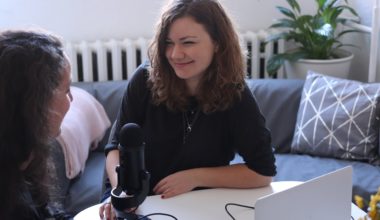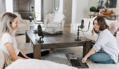
Branding is the most overlooked aspect of podcasting. Sure, you spent thousands of dollars on the equipment, fixing the acoustics of your recording space and paying for hosting. But, what about the podcast art? Is it an awkward image of you sitting in your basement studio? Is it a poorly taken snapshot of your pet? Or, is it a great image that is representative of your show? Your podcast art can be the difference between someone checking out your show or moving on to the next podcast.
I have seen so many podcasts with awful cover art. They are not inviting, they don’t tell you what the show is about, and they are not eye-catching. These shows may be really insightful or funny but if they have terrible cover art, I’m not going to click on it. It may be a small thing, but it makes a big difference.
Now you may call me a design snob. I love great design, and I am not ashamed to admit it. Here’s the thing – great design registers to me consciously. But for most other people it does so subconsciously.
Great design can make a big difference in the way people respond to something. But most people don’t know why. They just know that they like it.
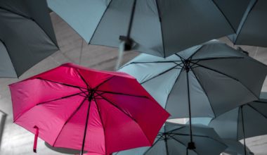
Think of the logos of top brands, with die-hard fans the world over. Nike, Apple, Starbucks. They are instantly recognizable and evoke a sense of quality and pride. What do they have in common? They are simple, bold and memorable. They evoke a feeling. And they look good at any size. Your podcast art should be no different.
In his book ‘Logo Design Love’, David Airey writes about how the best logos create an immediate emotional response. They get people excited about the company, product or service that they represent. This is the goal of your podcast artwork. To make your listener excited to listen to your show.
In this article, I will *ahem* cover how to get your podcast artwork looking professional, so that you can take your show to the next level.
But first, what is the purpose of your podcast? Is it to be a creative outlet for you? To share your passion with others? To educate? To inform? To entertain? Your podcast art should be representative of that purpose. The goal of your podcast artwork is to capture the essence of your show. Your artwork should evoke a feeling that makes the listener WANT to listen to your show. It should make them think, “Hey, this looks like something I would like to listen to.”
On any podcast app, there are hundreds of shows competing for attention at any given moment. If you are a trained or a self-taught graphic designer you could create something that stands out. But chances are you aren’t. So where to get podcast artwork that gets you that first click?
Luckily there are several sites where you can get quality artwork for a small fee. Like Fiverr or 99designs. 99designs even has a podcast category.
Spending fifty to a hundred dollars can get you great artwork here. Just see the freelancer’s portfolio and past reviews and if you like what you see, commission your podcast art. Be as clear as possible with what you want the cover art to look like. If you are unsure, just tell the freelancer what feelings you want to evoke.
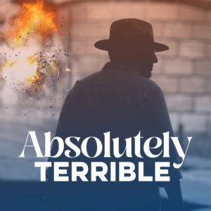
I should add that there are various ways to go about this, too. You can start with a stock image – you can get royalty-free images on Unsplash or Pexels, or for more niche-y ones, on StockSnap. These can be a great canvas for the artwork. You can then ask the artist to manipulate the image on Photoshop to add or remove elements to your liking. Then, you can ask them to add text on top. That’s what I did for one of my shows – Absolutely Terrible. It’s about really bad movies. I added the explosion effect on top of a royalty-free stock image, added a colour filter and then the text. The cover art is deliberately campy because the movies we discuss on the show are campy.
Text-on-image is a very obvious route. Big companies might commission photographers to get the exact image they want or they may buy premium stock images from Shutterstock. But you’ll be fine with a royalty-free image.
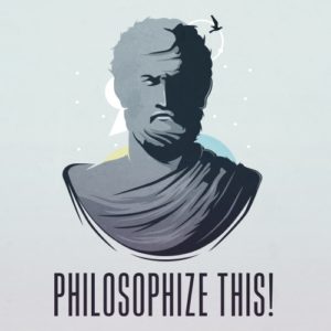
Another method is to treat the cover art as a logo. Nice typography, and a clean illustration on a solid colour background. Nothing wrong with that. See the artwork for Philophize This!, for example.
One trend that I abhor in podcast artworks is avatars or cartoons of the hosts. For some reason, people think this is an effective way to show off the hosts when in reality, it does the exact opposite. This may work if you are a comedian, or you are trying to create a parody podcast. But even in that space this trend is so heavily played out that it becomes difficult to stand out.
If you are trying to create an informative show, or that you want to be taken seriously, don’t put a Bitmoji on the artwork. You want your podcast artwork to showcase your brand, and your brand is not a cartoon of you or your co-hosts.
The same thing applies for podcast cover art with the face of the host. Unless the portrait is shot really, really well this looks bad. Podcasts hosted by celebrities usually have their faces on the cover art. But those images are shot by professional photographers who are experts in lighting, composition, and portraiture. If you want to go with this route get a professional photographer to shoot your portrait. Do not plaster a picture you clicked on your phone, in bad lighting, onto your cover art.
So there you have it. If you don’t have a background in photography or graphic design, hire a professional. Plain and simple. Do NOT cheap out on something this critical. Do NOT try to wing it. Do NOT ask your nephew who “has design software on his computer”. Find someone who can do a good job. And pay them. You don’t want to ruin your podcast’s reputation.
And always remember, it should look great on sizes as small as half an inch in height and width – that’s how it would appear on podcast apps.